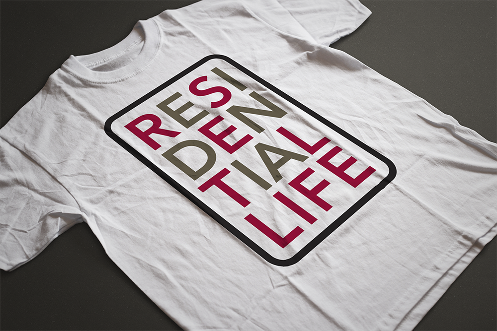
Client: Hamline University
Project: Residential Life Identity and Branding
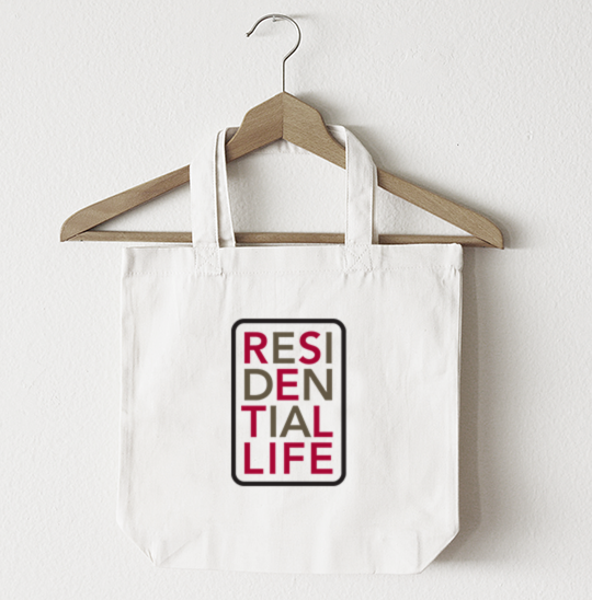
Brief: The Residential Life department at Hamline University wanted a logo for their department. Residential Life places students in housing and also builds community for those on-campus students by offering support, events and activities. The new logo would serve to support their efforts and build a presence for their campus community. The new logo would be used on bags, t-shirts, laundry bags, signage etc. We referred to the Hamline University branding guidelines for our color choices.
Solution: Residential Life’s new logotype is youthful and fun. We used two of Hamline University’s secondary colors from their branding guidelines. Although the logotype is created with two colors, we made sure it would work equally as well in a single color. It’s important for a logotype to functions in one color to make it work for the ways that Residential Life would use the logotype. And, it’s equally important that it has the ability to scale down for small business cards or tags, as well as scaling up for signage.
Previous ProjectNext Project
- Categories:
- Share Project :